Event Analysis
|
Collect
1. Video Explanation
Video introduction to the basic functions of event analysis
Video introduction to advanced functions of event analysis
2. Overview of Event Analysis
An event refers to a user behavior or business process that is tracked or recorded. For example, an e-commerce product may include the following events: user registration, browsing products, adding items to cart, payment orders, etc.
Event analysis refers to the query analysis based on event metrics, attribute grouping and conditional filtering functions. With the powerful filtering, grouping and aggregation capabilities of Sensors Analytics, event analysis can help answer the following questions:
Which channel has the highest number of user registrations in the last three months? How is the trend changing?
What is the average deposit amount per person in different time periods?
Last week, how many unique users from Beijing have made purchases according to their age distribution?
What is the number of independent sessions per day?
Reasonably configure tracked events and properties based on your product features to unleash the powerful potential of event analysis and answer various segmentation questions about trend changes and dimensional comparisons.
See how to apply event analysis functions with samples
3. Introduction of Event Analysis Dashboard Functions
You can analyze a single metric, such as the number of users trigger "submit orders" event , or you can add multiple metrics to analyze at the same time.
You can also download user behavior details related to the number of "trigger users" of the event, as shown below.
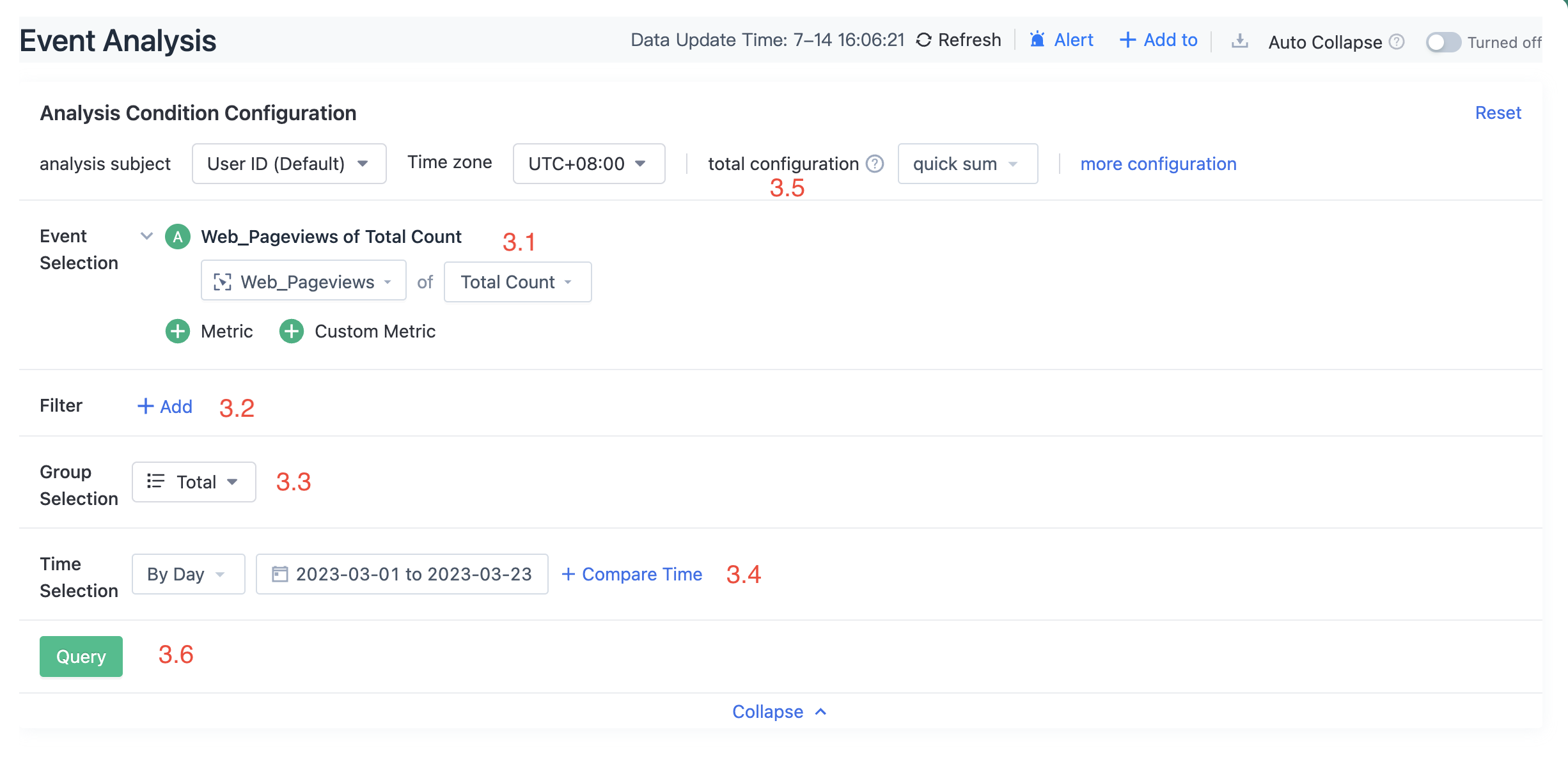
3.1. Choose Metrics
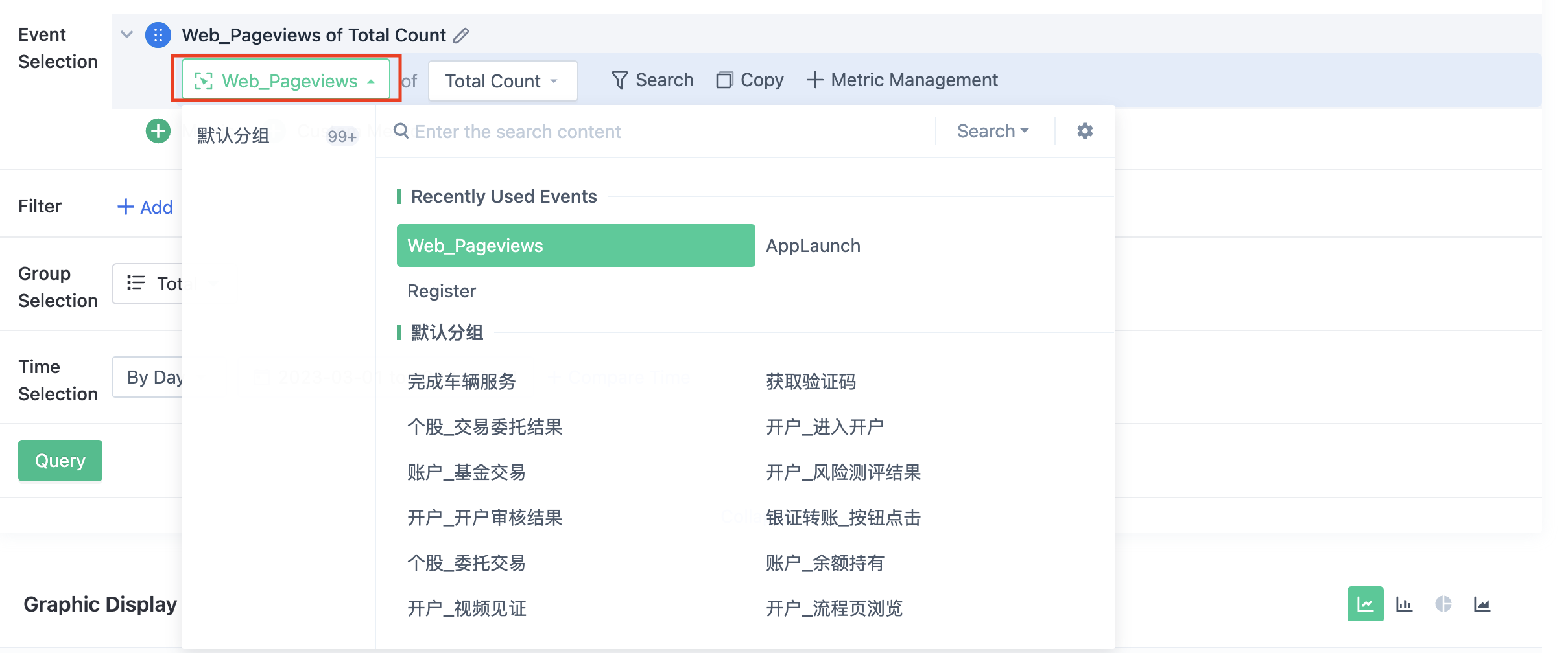
3.1.1. Add Common Metrics
Select the event in the first drop-down and the metric you want to analyze in the second drop-down. By clicking  , you can add multiple metrics.
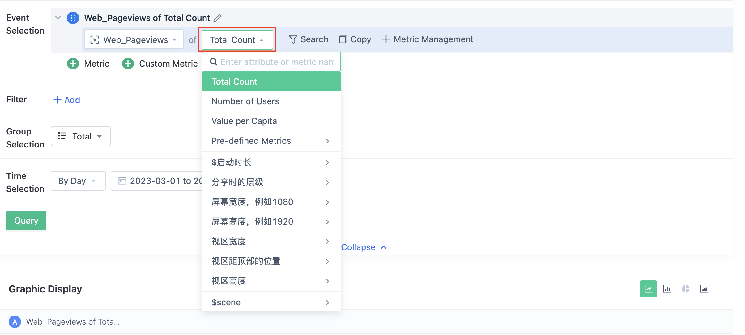
For all events, the following metrics can be analyzed:
- Total Count: The number of times an event was triggered within a designated time frame.
- Number of triggered users: The number of independent user IDs where the event occurred at least once within a designated time frame.
- Value per capita: The average number of times an independent user triggers the event within the selected time period.
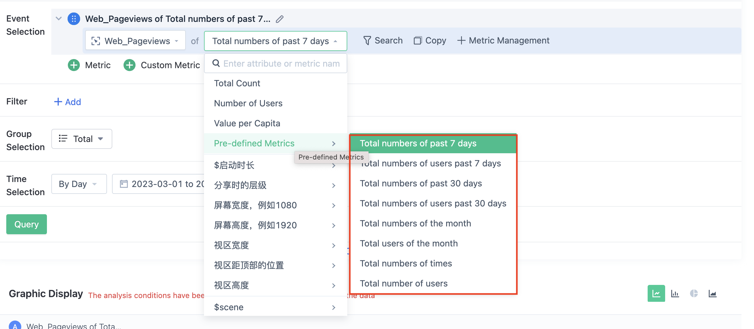
- Pre-defined metrics: Only available for daily queries, summarized statistics based on the event occurrence time or selected time range. Later in the example of using custom metrics, it will be introduced in detail.
For all types of attributes, the following values can be used as analysis metrics:
- Unique count: The number of unique independent appearances of the attribute within the selected time range.
For events with numeric attributes, the numeric attribute can also be used as an analysis metric:
- Sum: The sum of the attribute value within the selected time range.
- Average: The arithmetic mean of the attribute value within the selected time range.
- Maximum: The maximum value of the attribute value within the selected time range.
- Minimum: The minimum value of the attribute value within the selected time range.
3.1.2. Add custom metrics (used in conjunction with predefined metrics for analysis scenarios)
For some special analysis scenarios, custom metrics need to be used to achieve calculations. Starting from Sensors Analytics version 2.1, event analysis support predefined metrics as analysis metrics. Let's take two examples:
- The ratio of the number of active users on the current day to the number of active users in the current month. In this scenario, the number of active users in the current month is used as the denominator to participate in the calculation;
- The ratio of the number of active users on the current day to the number of active users in the selected time range. In this scenario, the total number of active users in the selected time range is used as the denominator to participate in the calculation;
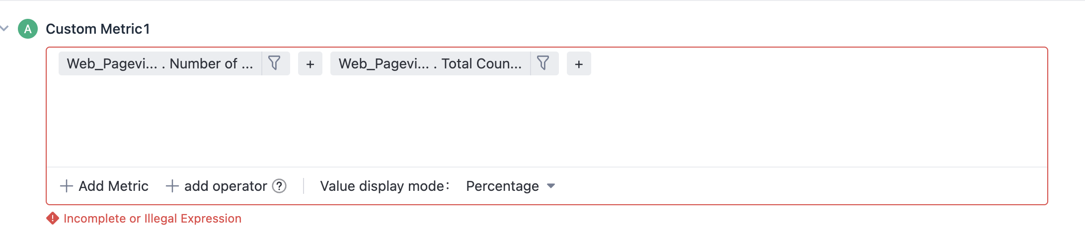
These two scenarios can be implemented by adding custom metrics. First, add a custom metric:
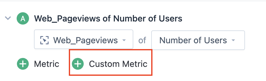
Can enter the initial interface of custom metrics:

Click anywhere in the editing box to edit custom metrics:
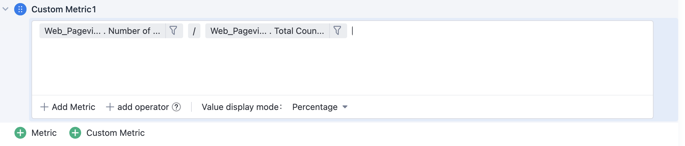
- Select the event to be added, configure the event metric, add an operator (+, -, *, /, brackets), and enter a value to obtain a custom metric expression that you want. For example, set the expression to "Number of users who submit orders"/"Number of users who submit orders this month";
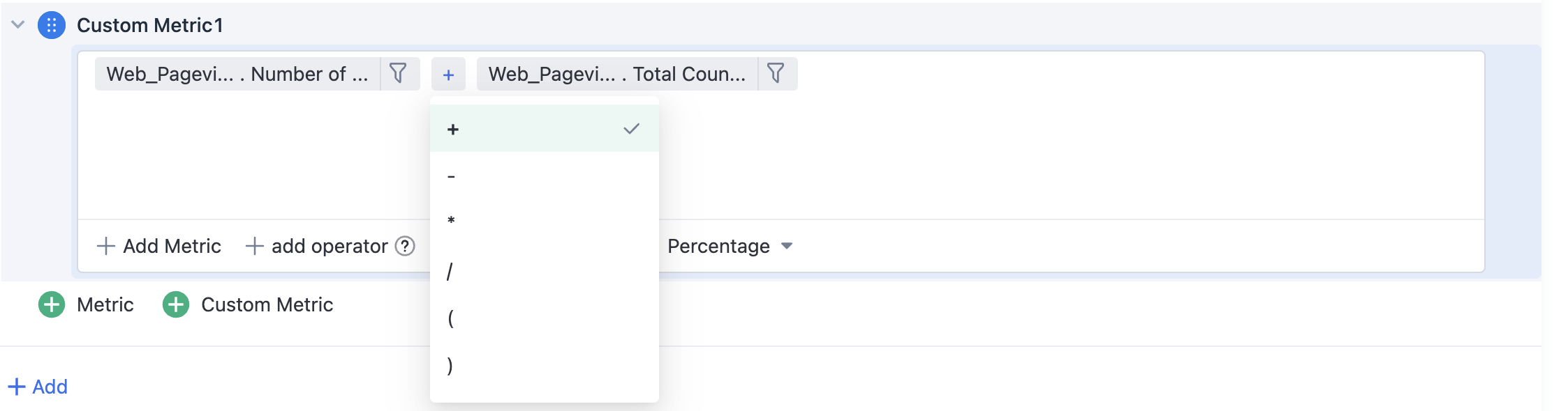
- The event, event metric, and operator in the expression can be adjusted by clicking, as shown in the following figure, where you can click the operator "+" to switch to other operators
- Click the filtering button on the right side of the event metric to configure filtering conditions for the event.
- After setting the metric calculation formula, you can select "Percentage", "Two decimal places", "Three decimal places", and "Rounding" as the display styles, and the default setting is "Percentage";
- You can customize a metric name, for example, rename it to "DAU/MAU of Orders Submitted";
- After editing, simply click outside the editing box to automatically validate the expression. If the expression is valid, it will be saved automatically. If the expression does not satisfy the arithmetic rules, an error message will be prompted and the expression must be modified and corrected before the custom metric query can be saved and applied.
3.2. Add Filter Criteria
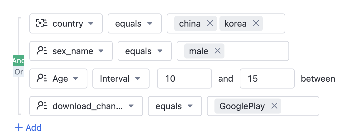
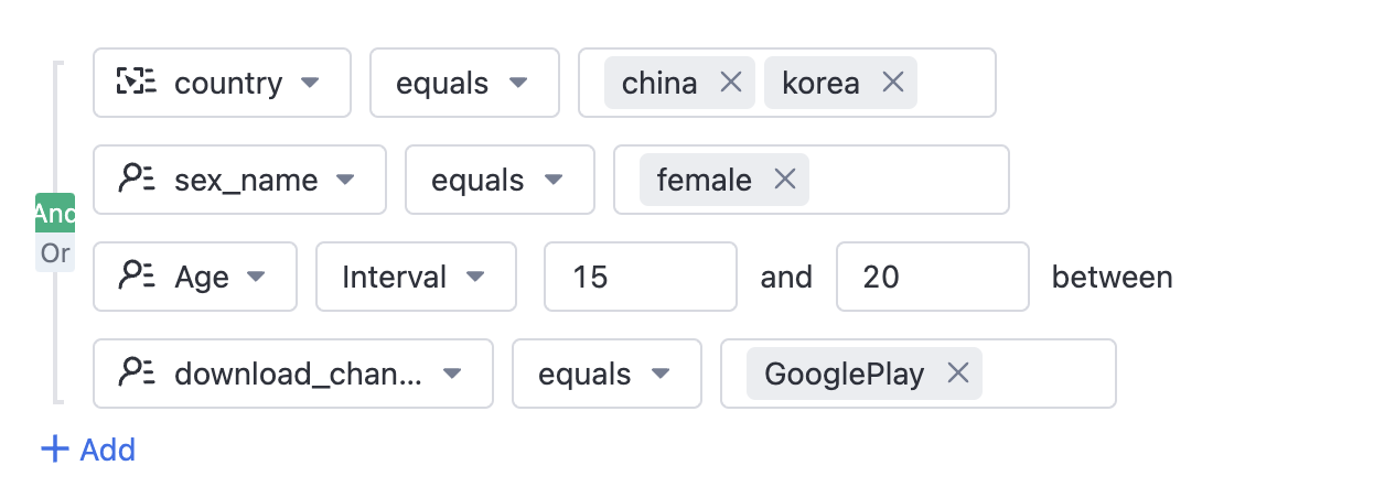
In the event analysis before version 2.1, if we want to limit the age range of male and female separately, we need to query twice. In this update, two levels of nested filtering are supported for direct querying.
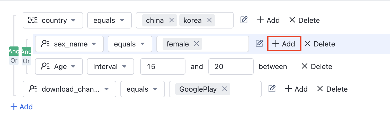
Click after the properties that you want to filter with the combination criteria![]() to add nested filters, set up as follows:
to add nested filters, set up as follows:
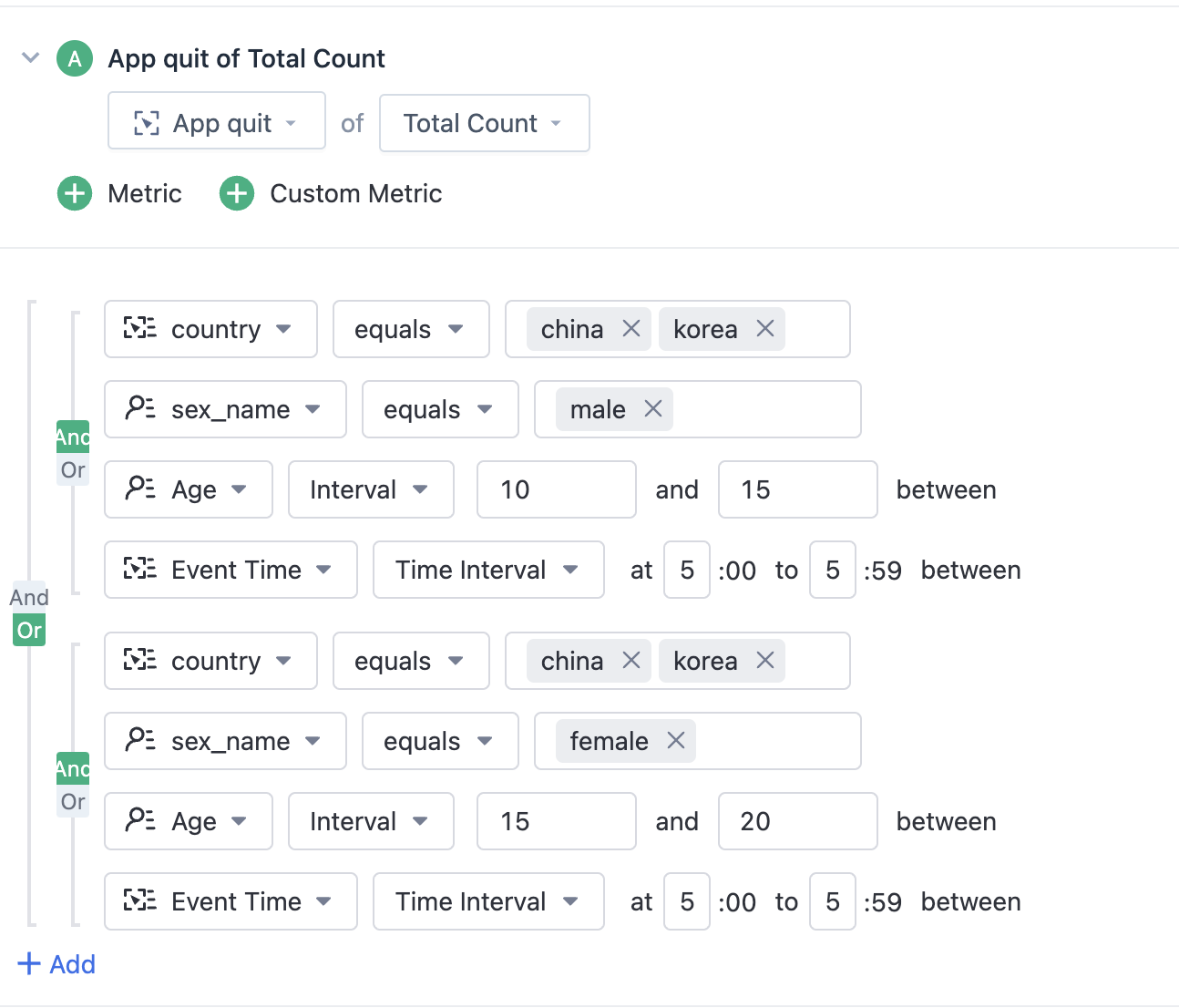
This update also adds a filtering attribute "Event Time", which can be filtered by "Time Period Interval" and supports filtering by hour (0-23).
3.3. View by grouping (dimension)
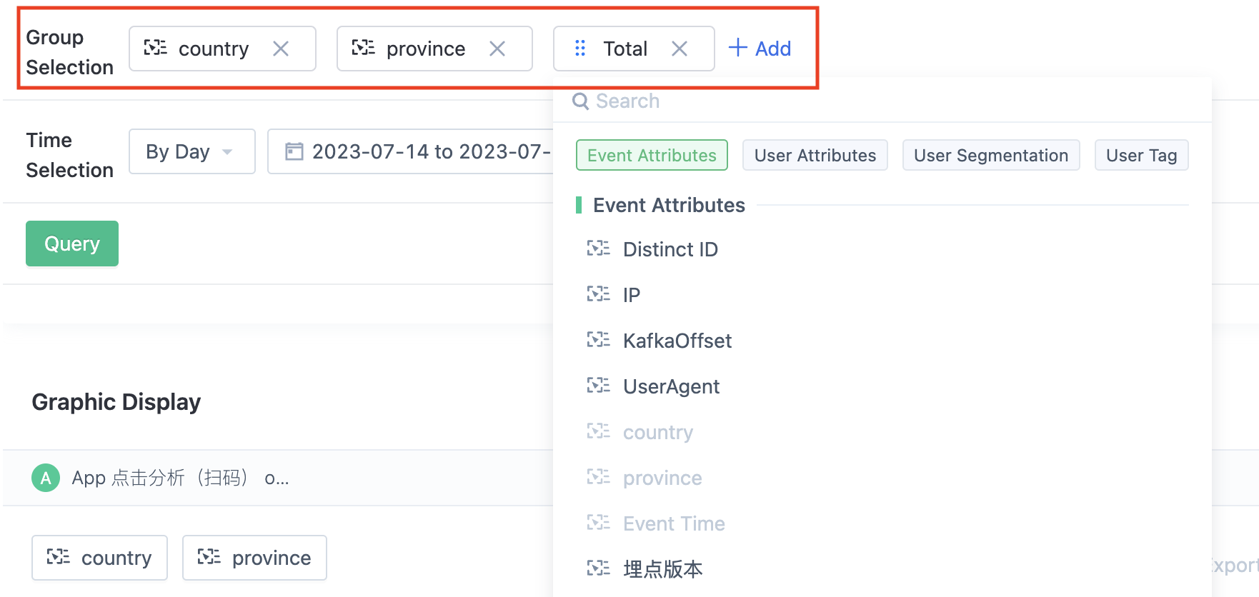
View data by dimensions for more refined analysis. Multiple dimensions analysis is supported here.
For example:
we can group users who have placed orders by country, province, and city in order to compare the number of users who have placed orders in different regions.
When the grouping attribute of the user is of numeric type, you can customize the grouping range.
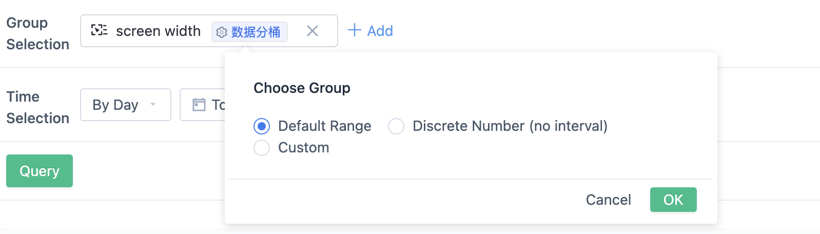
If the selected attribute here is of time type, you can choose not to aggregate and group the data by time unit of minutes/days/hours, or you can choose to group the data by time segment. For example, when grouped by day (date), the query will aggregate data by every day of the month, from the 1st to the 31st of the month, and the registration time attribute value displayed here is 1-31, meaning the aggregated data from the 1st day to the 31st day of each month. If grouped by minutes, the results will be 0-59.
If this parameter is not set, the query engine dynamically calculates the packet interval. This setting takes effect only for the current query and also in bookmarks after you save the query as a bookmark.
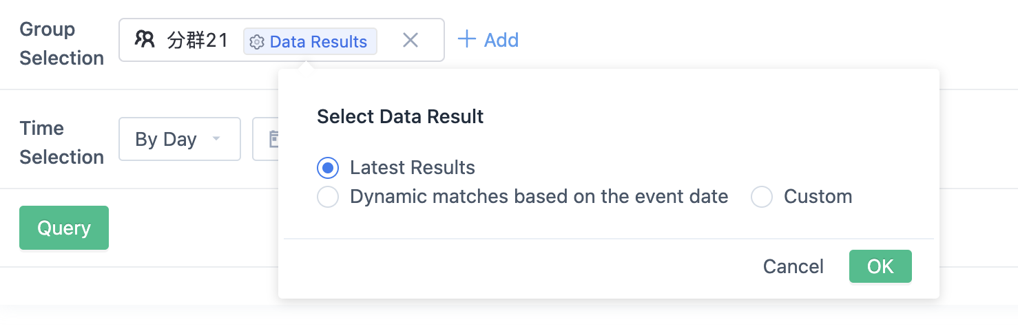
If choosing a segment or tag here, the data results of that segment or tag need to be selected. If selecting "latest result", the latest calculation result will be taken. If selecting "dynamic match", the calculation result with the event occurrence date and segment or tag basetime consistent will be taken. If choosing "custom", you can choose any historical calculation result.
Note: If the segment result of a certain basetime includes users up to yesterday, the segment will be calculated on T+1 day, basetime will be today. At this time, if the data result is selected as "dynamic match", it will lead to the occurrence date of the event being one day later than the behavior date of the users in the segment. If you want the event occurrence date and the user behavior date in the segment to be consistent, you can create a segment or tag with a time semantic relationship that includes today.
3.4. Time component
3.4.1. The time granularity of the query
Selectable data aggregation time unit, for example, if you choose to view the data of 2020-09-10:
- By minute: Aggregate by minute, that is, view the data of each minute on September 10, 2020. For example, the query time range of the data of 2020-09-10 00:00 is from 2020-09-10 00:00:00:000 to 2020-09-10 00:00:59:999. 0-59 minutes are 60 minutes in one hour. Up to 1 day of data can be displayed.
- By hour: Aggregate by hour, that is, view the data of each hour on September 10, 2020. For example, the query time range of the data of 2020-09-10 00:00 is from 2020-09-10 00:00:00:000 to 2020-09-10 00:59:59:999. 0-23 hours are 24 hours in one day. Up to 30 days of data can be displayed.
- By day: Aggregate by day, that is, view the data of September 10, 2020.
- By week: Aggregate by week, that is, view the data of the whole week in which September 10, 2020 is located.
- By month: Aggregate by month, that is, view the data of the whole month in which September 10, 2020 is located.
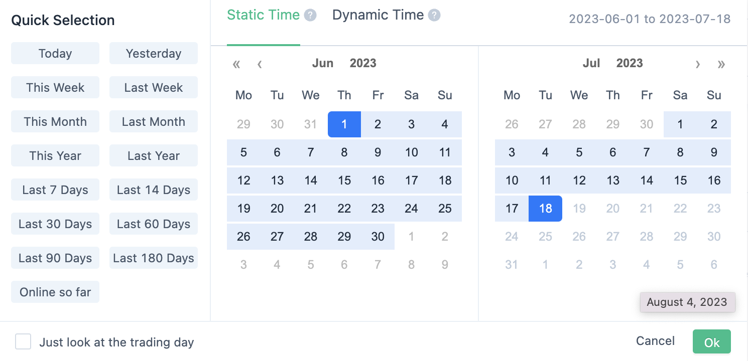
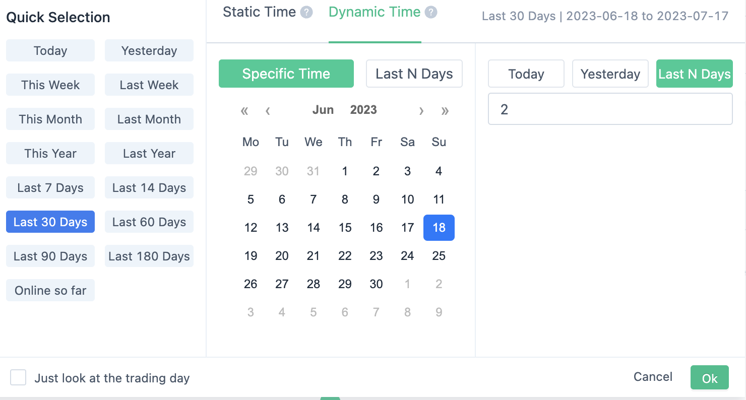
3.4.2. Static time and dynamic time
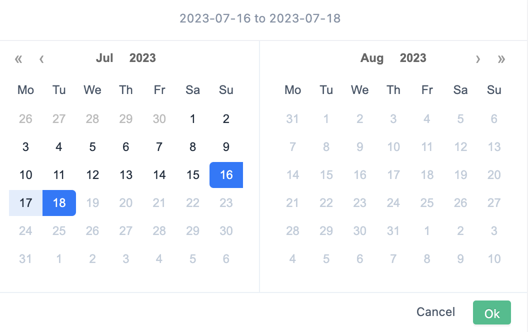
Under static time, the time range can be selected in the quick selection area or the start date can be selected in the calendar box. When saved to the dashboard, it will be set as a fixed time, and the date will not change with the passage of time.
For example:
Today is January 1st. We select "today" on the left and create a dashboard. The queried data is on January 1st. On January 2nd, the data time of this dashboard is still January 1st.
Under dynamic time, the time range can be selected in the quick selection area or the start date can be selected in the calendar box. When saved to the dashboard, it will be set as a dynamic time, and the date will change with the passage of time.
For example:
Today is January 1st. We select "today" on the left and create a dashboard. The queried data is on January 1st. On January 2nd, the data time of this dashboard is January 2nd.
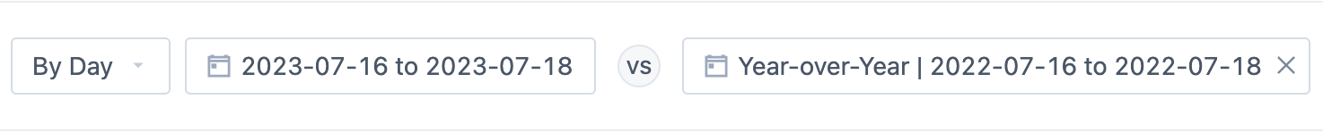
3.4.3. Time comparison
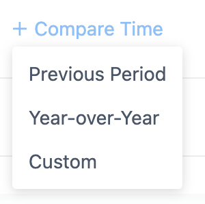
Support selecting "last period","same period last year","custom" as the comparison date.
For example:
Last period:
Last year same period:
Custom:

The comparison accuracy of different time granularities is as follows:
- Per minute: accurate to 59 seconds and 999 milliseconds.e.g. 5:05 PM today compared with 5:05 PM yesterday, the data of today from 5:05:00.000 to 5:05:59.999 is analyzed compared with yesterday from 5:05:00.000 to 5:05:59.999.
- Per hour: accurate to 59 minutes, 59 seconds, and 999 milliseconds.
- Per day/week/month: accurate to 23 hours, 59 minutes, 59 seconds, and 999 milliseconds.
3.5. The total number of configured switches
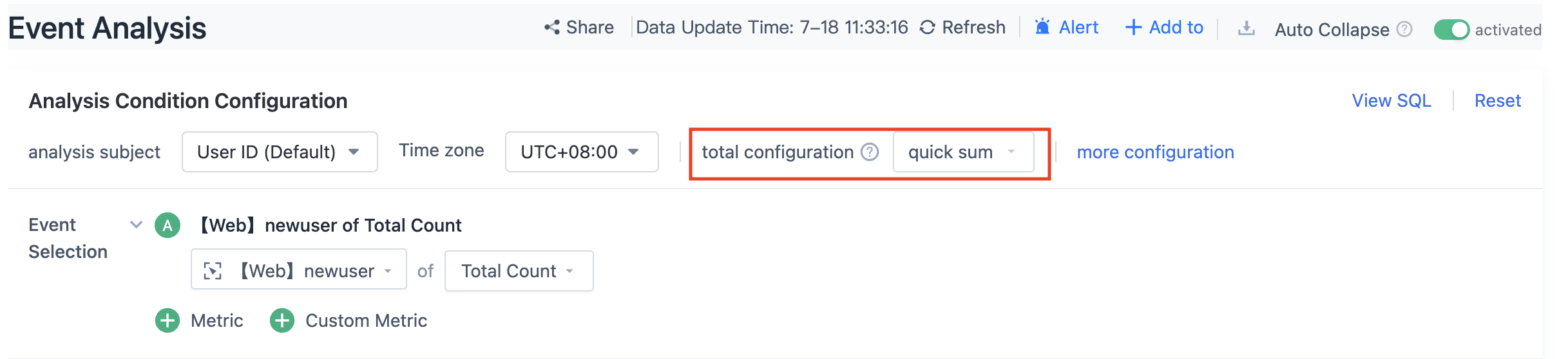
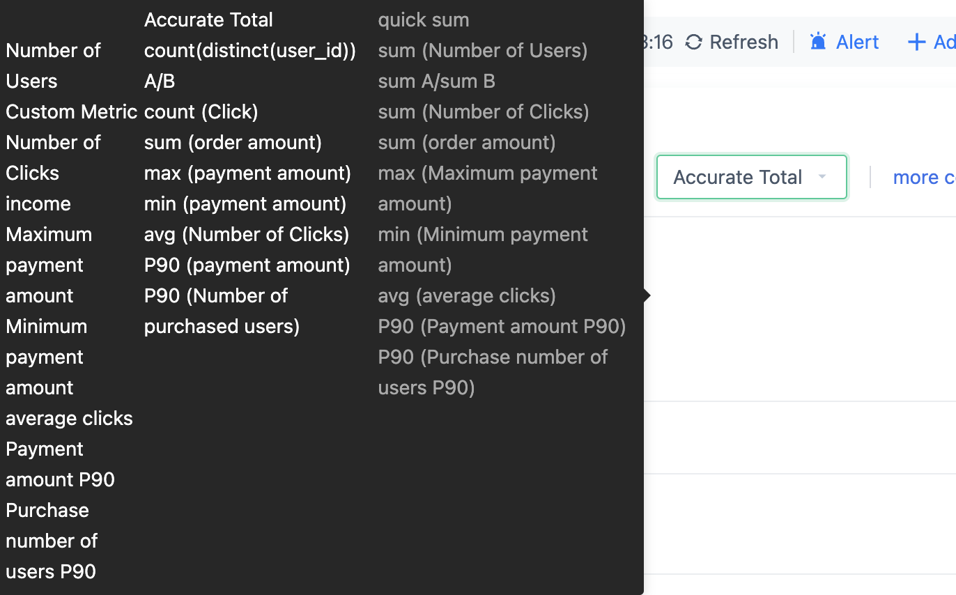
Two calculation methods are supported, including "quick sum" and "accurate total". As "quick sum" can improve query speed, it is recommended to use it for queries without accurate total requirements, such as deduplicating results of user numbers without the need to view the query time range.
The differences in calculation method between the two methods for some indicators are detailed below:
3.6. Query
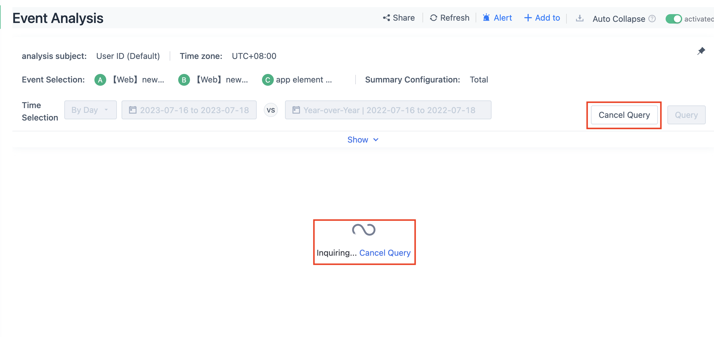
3.6.1. Cancellation is supported during the query process.
During the query process, you can interrupt at any time and then edit the query conditions or view the last queried data.
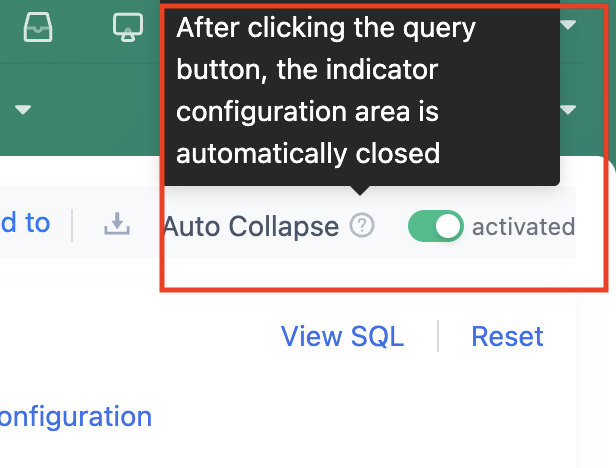
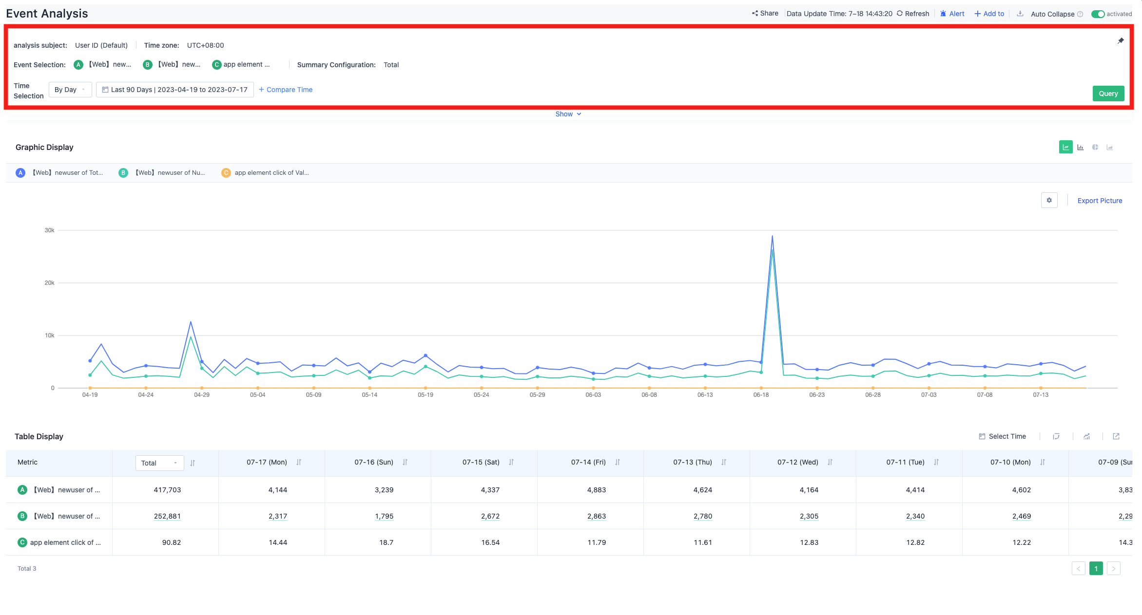
3.6.2. The index configuration area will automatically collapse after the query is complete.
After the page query is complete, the index configuration area will automatically collapse to display the data already queried in a larger area.
This function can be turned on or off by the "Auto Collapse" switch in the upper right corner.
Support displaying the configuration details of selected metrics in the collapsed state.
When collapsed, you can modify the time granularity and time filter conditions, and quickly initiate a query.
You can freeze the collapsed area at the top of the page while viewing the configuration conditions and comparing chart data, and only scroll the chart area up and down.
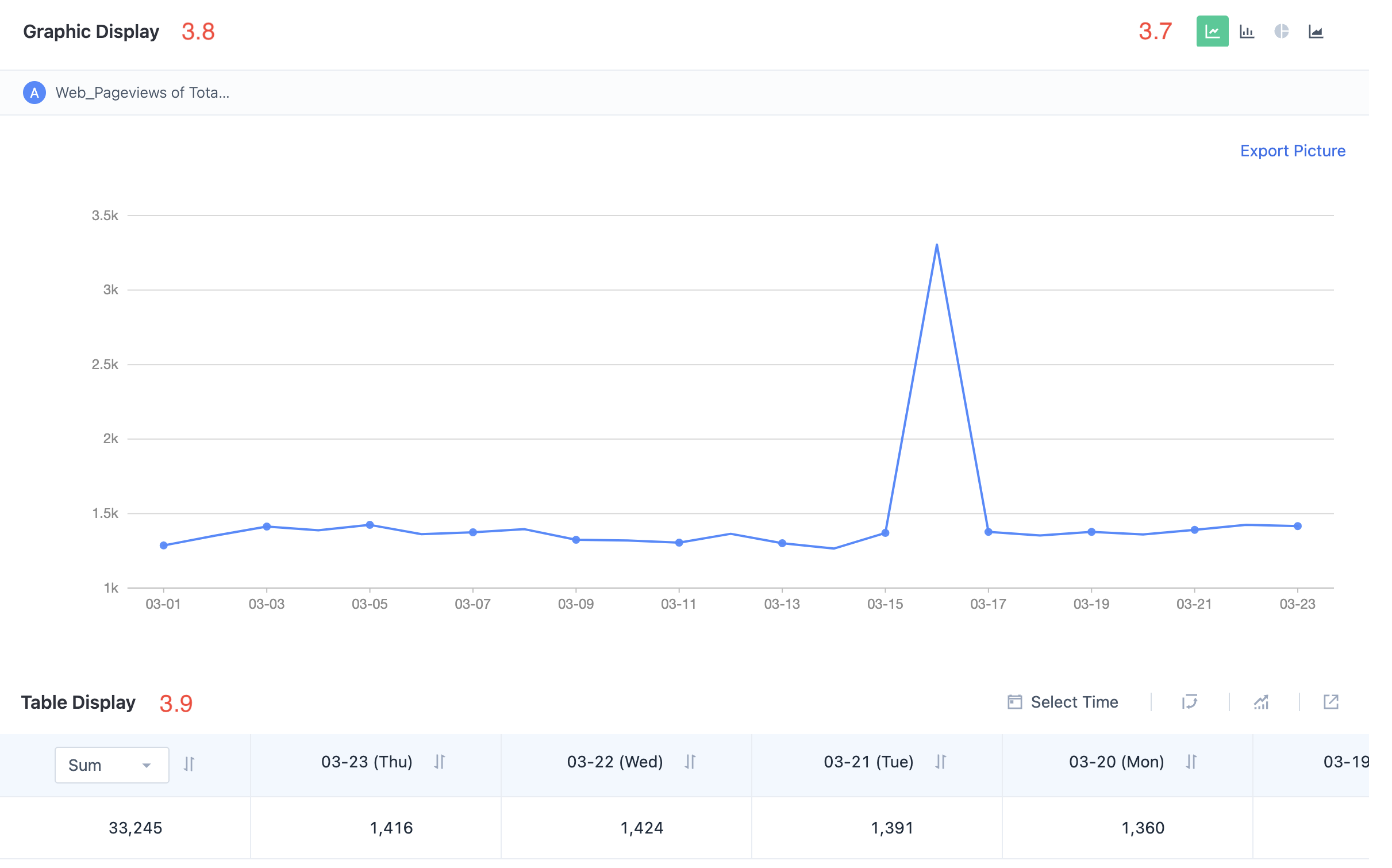
3.7. Chart Type Switching
Available chart types:
- Line Chart
- Bar Chart
- Pie Chart
- Stacked Chart
3.7.1. Line Chart
All query scenarios support previewing the line chart.
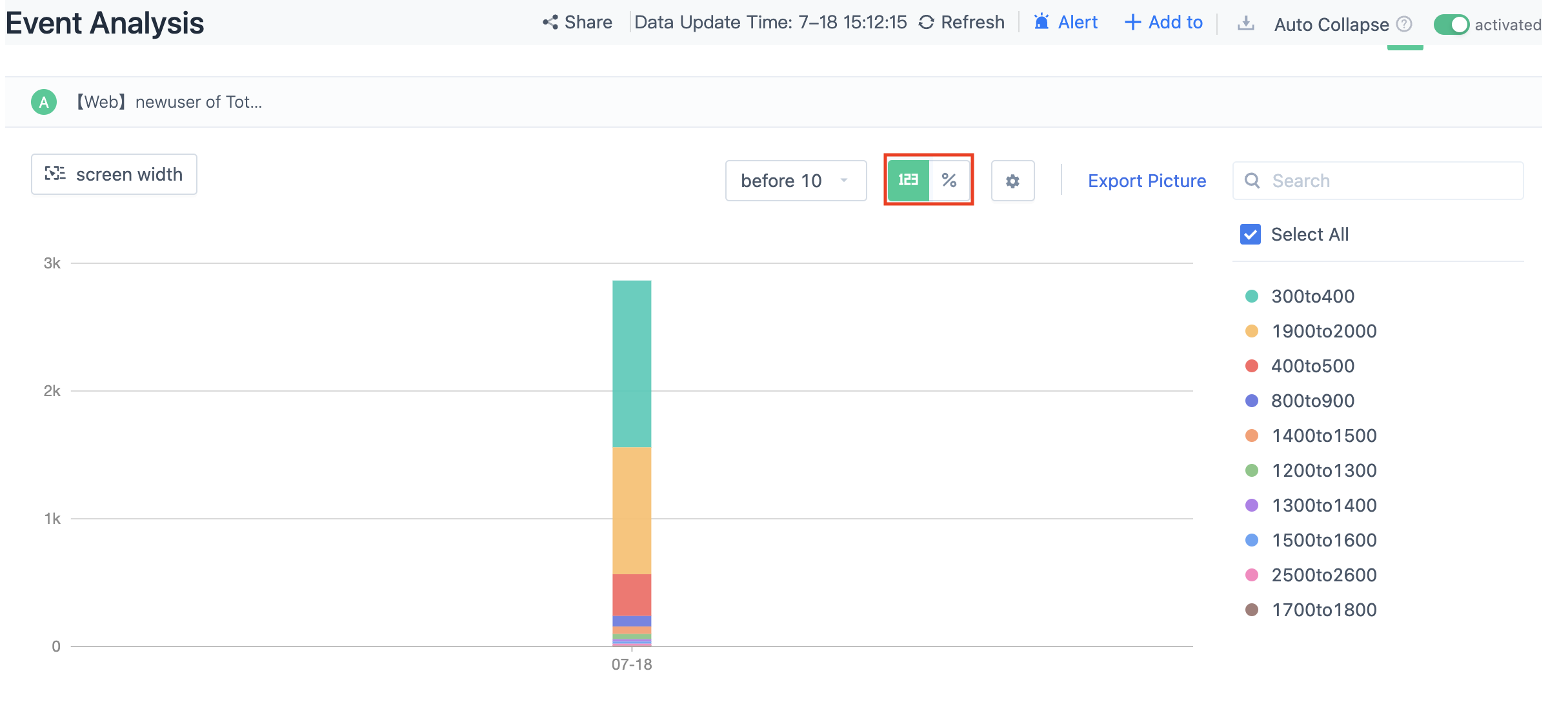
3.7.2. Bar Chart
All query scenarios support previewing the bar chart.
The bar chart supports two display modes: numerical type and percentage type.
The bar chart supports setting the vertical and horizontal axes.
When multiple metrics are selected, the bar chart supports setting the vertical axis of the metric as the left or right axis.
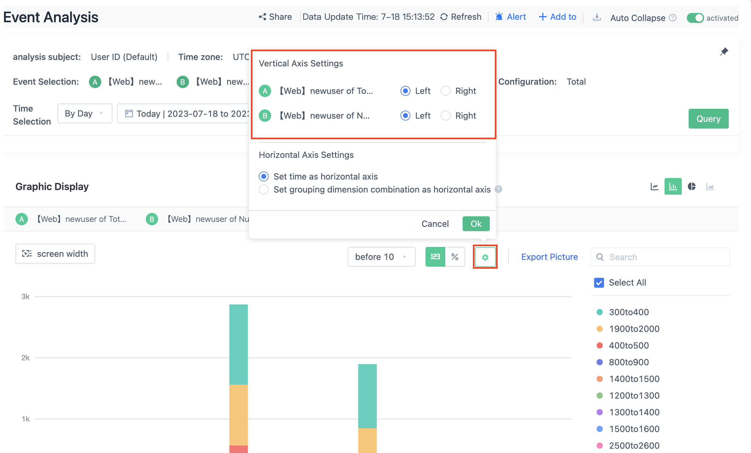
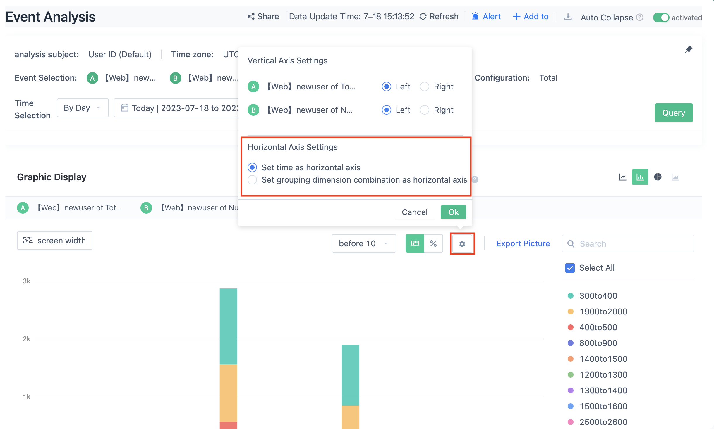
When the grouping dimension is selected, the horizontal axis supports selecting "Time as the Horizontal Axis" or "Group Dimension Combination as the Horizontal Axis".
If "Group Dimension Combination as the Horizontal Axis" is selected, the summary data of the selected time range will be displayed according to the grouping dimension combination. At this time, the metric data can only be displayed in numerical type and percentage selection is not supported.
3.7.3. Pie Chart
Pie chart preview is supported in query scenarios with grouping.
Pie chart preview is not supported when predefined metrics are used in the query.
3.7.4. Cumulative Curve
Cumulative curve preview is supported when the query only contains the total count and sum of metrics.
Cumulative curve preview is not supported when predefined metrics are used in the query.
3.8. Filtering in Charts
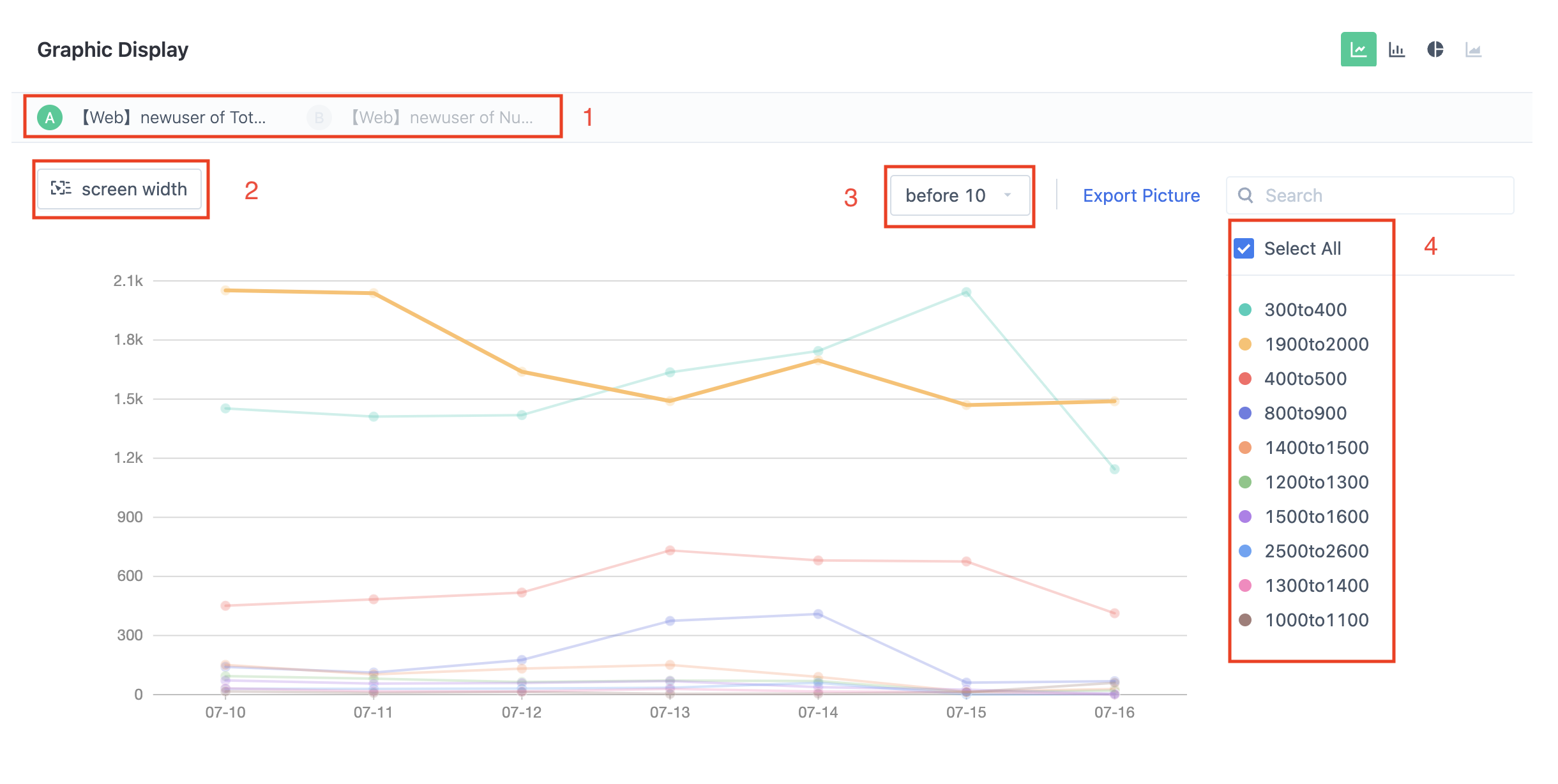
Four dimensions in charts support filtering:
- Select the metrics you want to display in the graph by clicking.
- Adjust the display grouping by applying filters.
- Adjust the number of lines displayed in the graph by selecting TopN.
- Further adjust the items displayed in the chart by clicking on the legend.
3.9. Table
Tables have been re-designed in this update. Tables can display data in layers/flats, and the analytical ability provided by tables is enhanced.
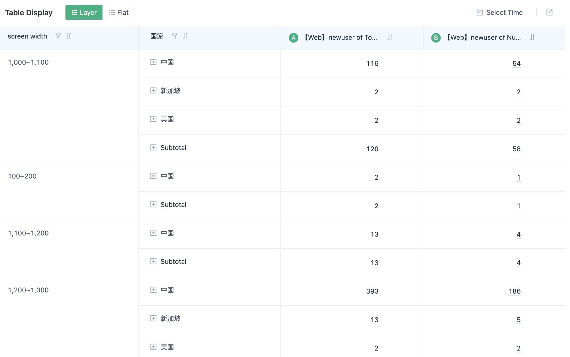
3.9.1. Layer Display
Tables support layer display if the query contains two or more layers of grouping.
The column proportion switch is available in the layer table (click % in the upper right corner of the table).
A "Subtotal" row is displayed in the last layer of the layer table, which summarizes the results of the current group.
The layer table supports a grand total value for the entire data.
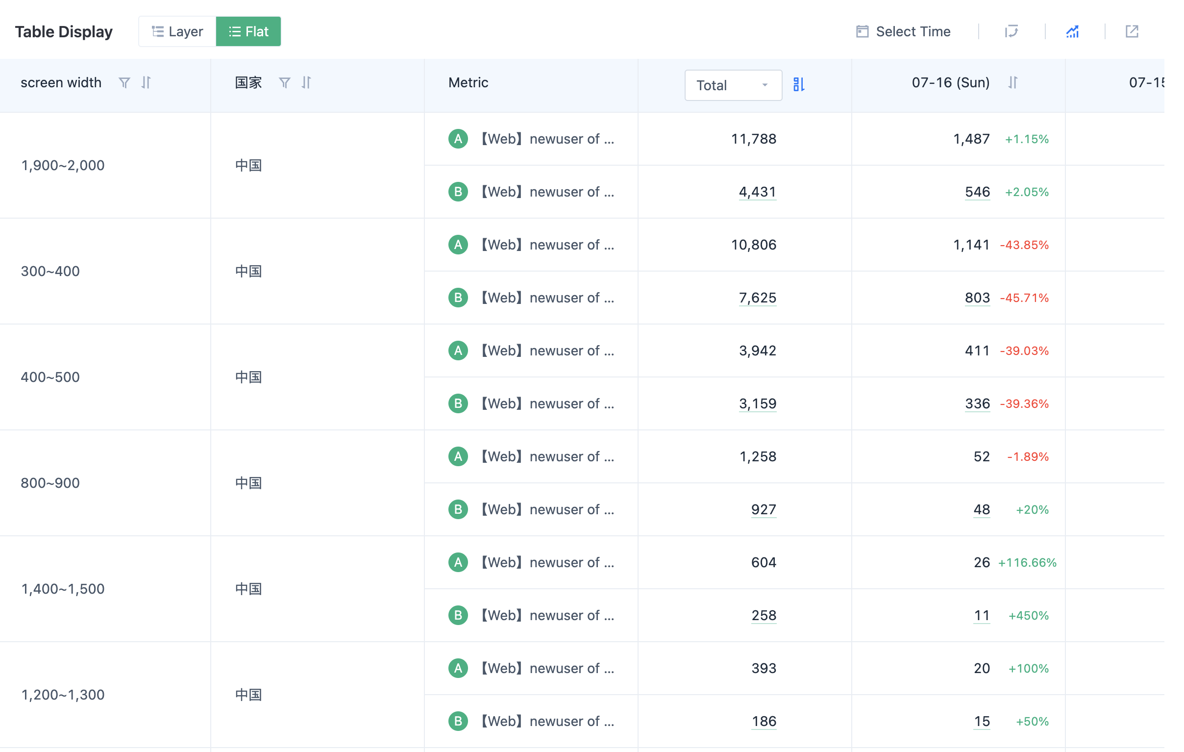
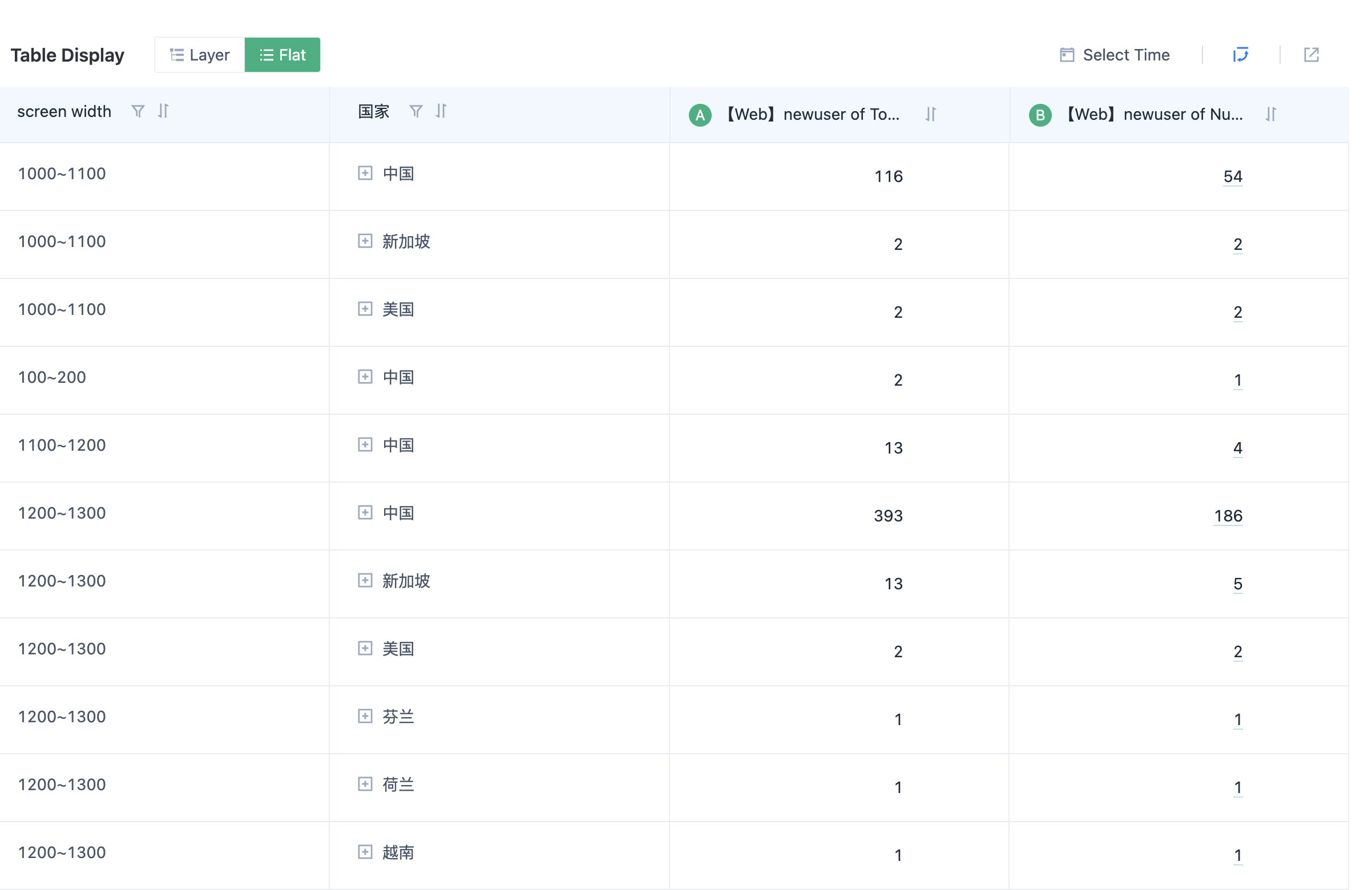
3.9.2. Flat Display
You can click on the upper right corner to expand/collapse the date switching between rows and columns to support viewing data by date/viewing data by metric flat display mode.
In flat display mode, the growth rate of chaining ratio is supported. "Ring ratio = (this period's metric - last period's metric) / last period's metric".
3.9.3. Export data to Excel
3.9.3.1. Excel content classification:
"Summary Data" corresponds to the format of the table when displayed by tier, does not include details for each expanded date.
"Detail Data" corresponds to the original detailed data in the table and supports the rapid generation of pivot tables using this data.
"Horizontal Date Data" corresponds to the data displayed horizontally in the table.
"Pivot Table" appears if the table data supports generating pivot tables. Generating pivot tables requires meeting three conditions:
- Time comparison is not enabled.
- There is at least one grouping in the query conditions.
- There is at least one metric available for subsequent calculation in the Excel pivot table in the query conditions, such as "total count", "total sum", "maximum value", "minimum value".
3.9.3.2. Excel File Format for Each Scene:
No grouping, any number of metrics
Export Excel files include "Summary Data" + "Detail Data" + "Horizontal Date Data".
One or more groups, metrics contain non-distinct count metrics
Export Excel files include "Summary Data" + "Detail Data" + "Horizontal Date Data" + "Pivot Table".
One or more groups, metrics do not contain non-distinct count metrics
Export Excel files include "Summary Data" + "Detail Data" + "Horizontal Date Data".
3.10. Reset and Switch Calculation Precision
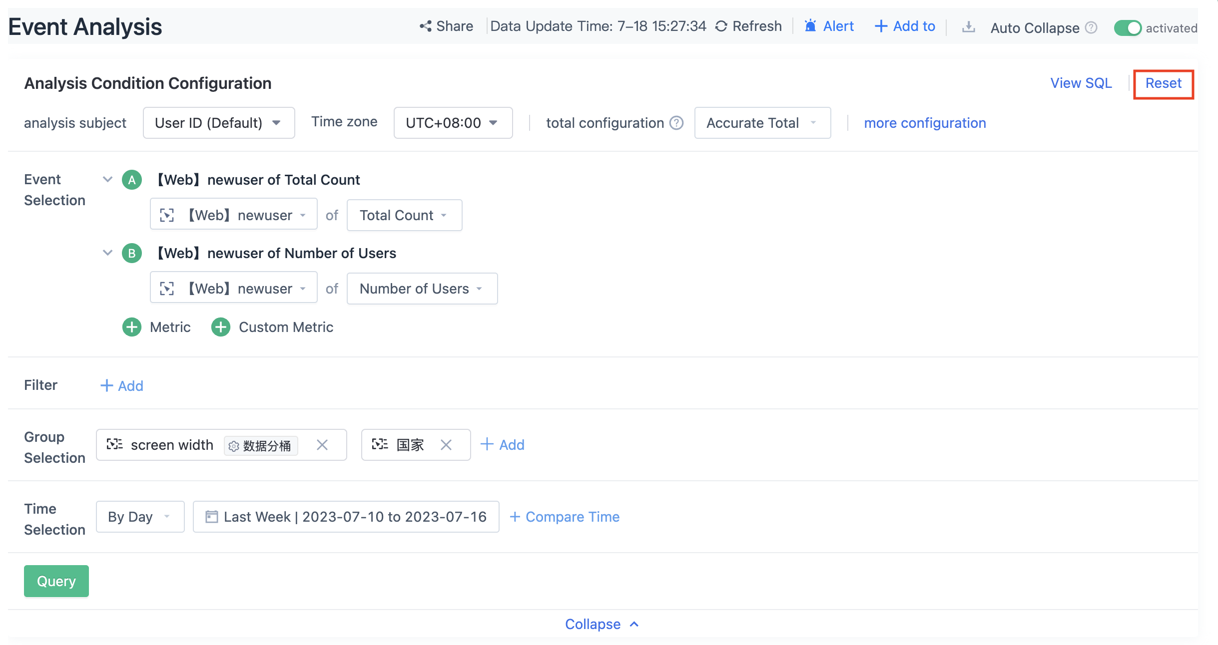
When a large number of conditions have been configured and new conditions need to be reconfigured, the operation is cumbersome and requires deleting existing configurations. In this update, we provide a reset function.
After resetting, the metrics, grouping, and filtering conditions will be cleared and the metrics will be reset to "total count of any event". If there are no events, the total count of the first event in the event list will be used. The event component will be reset to daily, and the date will be the most recent date with available data.
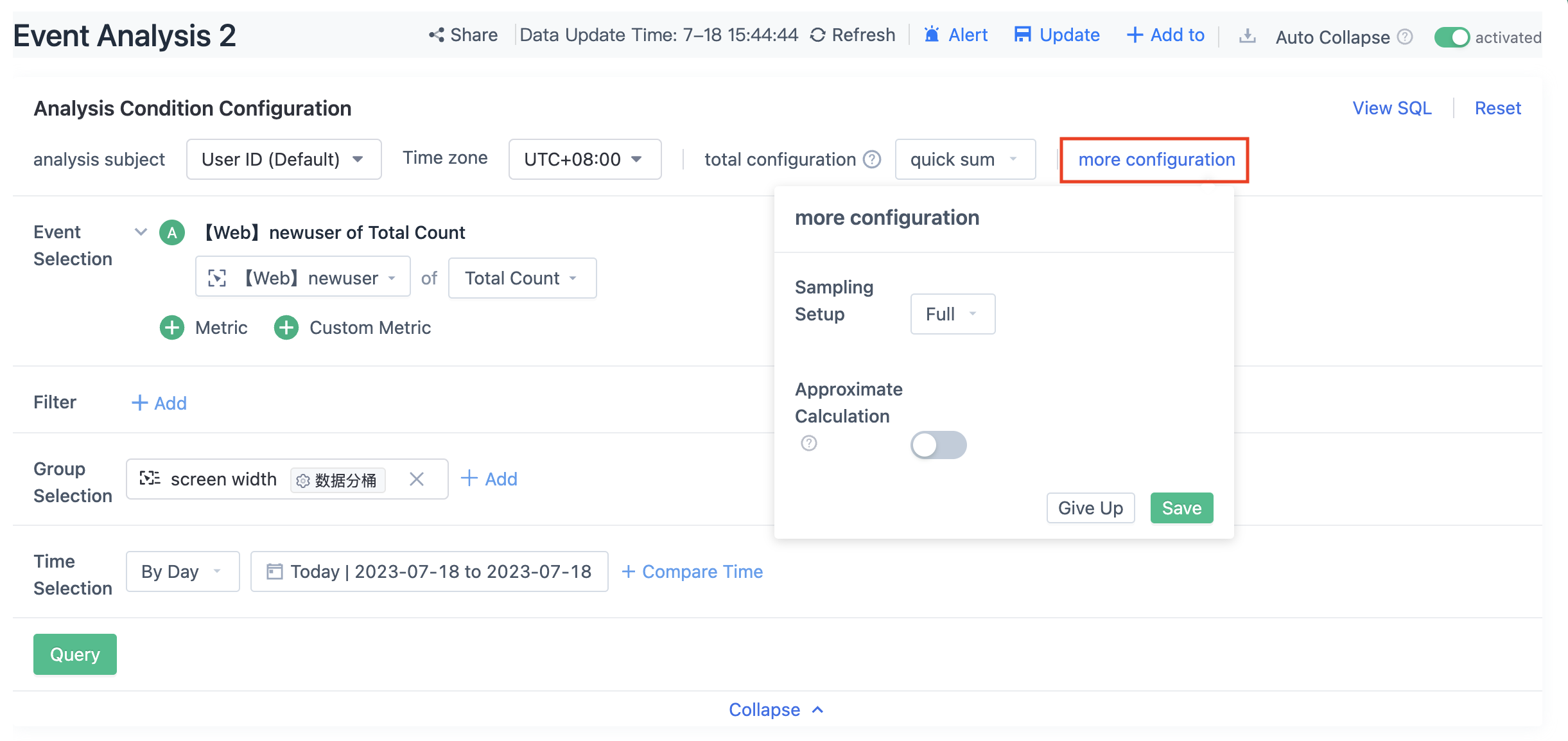
You can select "Exact Calculation" and "Approximate Calculation" for event analysis. Approximate calculation is only effective for metrics related to the number of triggered users, including triggered user count, average number of times per person, attribute average value per person, and custom queries consisting of the three above metrics. Approximate calculation uses the HyperLogLog algorithm and has a 2% error compared to exact calculation. Using approximate calculation can speed up queries.
3.11. View SQL
Event analysis supports viewing SQL. When there are data problems that need to be investigated, users can copy the query SQL and go to custom queries for further investigation.
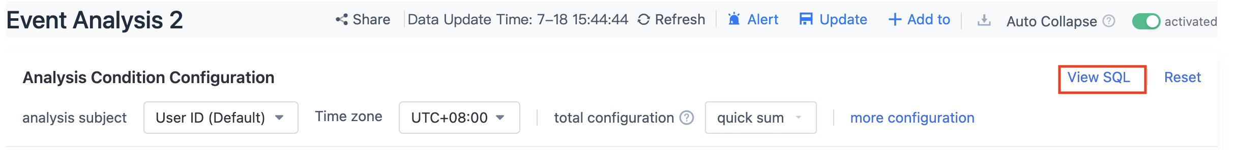
Note: This feature is a configuration item for operations and maintenance, and is not enabled by default. Please contact the Sensors Data staff if necessary.
4. FAQ
4.1. Why are the results different when viewing yesterday's data today and viewing today's data yesterday on the App side?
A: The App side has a cache mechanism.
4.2. Too many groups cause incomplete data display
A: Complete data can be obtained through the query API.
4.3. Why is the user count inconsistent between grouping and viewing overall?
A: Taking the city as an example, if the same user browses the same web page in Beijing and Shanghai, if viewed overall, the quantity is 1. If viewed by city, both Beijing and Shanghai will have this user in their user counts.
4.4. Why is the total value of users not consistent with the sum of users per day?
A: The user count has a de-duplication mechanism.
4.5. Why is the data different when viewed by day and by week?
A: Viewing by week shows the data for the natural week.
Note: The content of this document is a technical document that provides details on how to use the Sensors product and does not include sales terms; the specific content of enterprise procurement products and technical services shall be subject to the commercial procurement contract.
 Popular Searches